



What Is the Best Color for a Meditation Room?
What Is the Best Color for a Meditation Room?
Quick Summary
The best meditation room color is a soft blue or gray-blue, because cool tones support calm focus without feeling cold. Soft green is a close second for a nature-inspired feel. Keep saturation low so your walls do less, not more.
- Gray-blue suits bright rooms, while light blue holds up better in low light.
- Avoid bright lime and deep forest green, which pull the eye and break the quiet.
- North-facing rooms want warm-leaning neutrals or sage with a yellow undertone.
- Paint swatches at least a foot square, two coats, on two different walls.
- Live with your swatches for three days and check them under your real bulbs.
Table of Contents
- Why Meditation Room Color Schemes Shape Relaxation
- What Is the Best Color for a Meditation Room?
- Zen Colors for a Meditation Room: Neutrals and Gentle Accents
- Calming Paint Colors That Work With Your Room's Light
- Meditation Room Ideas: Pairing Color With Statues, Textiles, and Materials
- How to Test and Apply Your Color Scheme
- Browse Statues That Complete Your Meditation Space
- Frequently Asked Questions
Why Meditation Room Color Schemes Shape Relaxation
The right meditation room color schemes for relaxation start with one idea: your walls should do less, not more.
At HD Asian Art, we spend our days with pieces meant for quiet rooms.
Color psychology is the study of how hues affect mood and attention. Cool shades tend to slow us down.
A paint chip on a wall is only half the story.
What Is the Best Color for a Meditation Room?
The best color for a meditation room is a soft blue or gray-blue, because cool tones support calm focus without feeling cold. Soft green is a close second for anyone who wants a nature-inspired feel.
That is the short answer. The longer one depends on your light and your taste. A north-facing room reads cooler than a sunlit one, so the same paint can look different in each.
Soft Blue and Gray-Blue for Calm Focus
Soft blue is the safest pick for a meditation space. Light blue and gray-blue shades feel airy and quiet. They pair well with wood, linen, and bronze.
Gray-blue works best in bright rooms. In a dark room, it can turn heavy. Light blue holds up better in low light.
Try these shades:
- Pale sky blue for a small, bright room
- Gray-blue for a larger space with good windows
- Muted slate blue for an evening practice room
Nature-Inspired Greens for Balance
Green brings the outside in. Soft green, pastel green, and muted sage all read as calm and grounded. They suit a Zen room or yoga room where you want a sense of growth and balance.
Avoid bright lime or deep forest green. Both pull the eye and break the quiet.
Sage and olive work well behind a wooden altar. A pale green wall also flatters brass and bronze.
Zen Colors for a Meditation Room: Neutrals and Gentle Accents
Zen colors for a meditation room are soft earth tones: white, beige, warm gray, and gentle accents of lavender or pale yellow.
A neutral base is the easiest choice for a beginner. It never fights with your decor, and it makes a single focal piece stand out.
The basics of color and human response from the American Psychological Association offer useful background on how shade and setting shape mood. The takeaway for a meditation room is simple: keep saturation low.
White, Beige, and Warm Gray as a Base
White and beige open a room up. Warm gray adds depth without coldness. Together they form a calm backdrop for almost any style, from boho to minimalist.
- Warm white: best for small rooms and renters
- Beige: soft and forgiving under warm bulbs
- Warm gray: grounds a large room with tall ceilings
Lavender, Indigo, and Pale Yellow Accents
Accent colors add character without breaking the calm. Lavender and indigo bring a quiet, contemplative note. Pale yellow adds a touch of warmth, like early morning sun.
Use them sparingly:
- One accent wall behind your altar
- A cushion, throw, or curtain in the accent shade
- A painted tray or small shelf
Guidance on visual comfort and lighting from the U.S. Department of Energy is worth a look before you commit. Bright, harsh light changes how any accent color reads.
Bronze is a natural fit for a neutral palette. You can read more about why bronze suits a grounding centerpiece if you are choosing a material for your focal statue.
Calming Paint Colors That Work With Your Room's Light
Calming paint colors only work if they suit your light. The same soft blue can look fresh at noon and gray at night. Most guides skip this, so here is the part that actually decides whether a palette holds up.
Read your room's orientation first
Window direction sets the baseline temperature of the light:
- North-facing: cool, indirect light all day. Cool grays and blue-grays can turn chilly, so lean toward warm-leaning neutrals, sage with a yellow undertone, or a blue with a touch of green.
- South-facing: warm, strong light. Cool shades balance the glare well, gray-blue, slate, and muted lavender read calm instead of washed out.
- East-facing: warm morning light, cooler afternoons. Mid-tone greens and soft blues hold steady across the day.
- West-facing: cool mornings, warm, intense late light. Pale neutrals and light blue keep the room from feeling hot in the evening.
Match the shade to room size and daylight
Small rooms benefit from lighter shades because they bounce light and feel bigger. Large rooms can carry deeper tones like slate blue or olive without going heavy. If your room has little natural light, lean lighter and warmer, a warm white or beige with a yellow undertone reflects more light than a cool gray. If it floods with sun, cooler shades balance the glare.
Watch the undertones, not just the color name
Two paints both called "sage" can read completely differently. Check the undertone on the label or chip:
- A green with a yellow undertone warms a cool, north-facing room.
- A green with a blue or gray undertone cools a sunny, south-facing room.
- A gray with a warm (taupe) undertone stays soft under warm bulbs; a cool gray can look blue or dingy in low light.
Test under your actual bulbs
Bulb temperature changes everything. Before you commit, look at your swatches under the bulbs you actually use in the evening, not just in daylight. Guidance on visual comfort and lighting from the U.S. Department of Energy is worth a look before you buy.
A simple rule: pick the wall color in daylight, then confirm it at night under your real bulbs. If it still feels calm at both times, it will work.
Window direction sets the baseline temperature of the light, so match your shade to it.
| Room orientation | Light quality | Colors that work |
|---|---|---|
| North-facing | Cool, indirect light all day | Warm-leaning neutrals, sage with yellow undertone, blue with green |
| South-facing | Warm, strong light | Gray-blue, slate, muted lavender |
| East-facing | Warm mornings, cooler afternoons | Mid-tone greens and soft blues |
| West-facing | Cool mornings, warm intense late light | Pale neutrals and light blue |
Meditation Room Ideas: Pairing Color With Statues, Textiles, and Materials
Meditation room ideas work best when color, texture, and objects agree. Pick the wall first, then let your statue and fabrics echo it.
A soft green wall pairs well with a bronze figure and natural linen. A gray-blue room suits pale wood and cream cotton. A neutral beige room lets a dark stone statue become the focal point. If you are deciding where and how to place that statue against your new color scheme, see how to display Buddhist statues in your home.
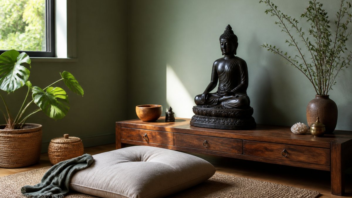
The sage walls, warm light, and natural textures create a calm foundation, while crystals for meditation can add another tactile accent to the altar.
A few pairing rules we follow:
- Match warm metals like bronze and brass to warm neutrals
- Keep textiles in the same family as the wall
- Let one object carry the strongest color
How to Test and Apply Your Color Scheme
Testing a color scheme takes about a week and costs little. The goal is to see each shade in real light before you paint a whole room. Here is a workflow that starts with the mood you want, not the paint chip.
Step 1: Define the mood in one sentence
Before you look at colors, write down what the room should feel like, "quiet and grounded," "bright and airy," or "warm and enclosed." That sentence filters every choice that follows. A room meant for evening practice wants a different palette than one used at sunrise.
Step 2: Shortlist three shades across families
Pick one blue, one green, and one neutral so you can compare how each family behaves in your light. Note the undertone on each chip, warm, cool, or neutral, because that is what changes under different bulbs.
Step 3: Paint large swatches, two coats, on two walls
Small chips read brighter than full walls, so paint swatches at least a foot square. Put them on two different walls, ideally one that gets direct light and one that stays shaded. Two coats, because one coat never matches the final color.
Step 4: Live with them for three days
Check each swatch in the morning, at midday, and at night under your real bulbs. A shade that looks calm at noon can turn gray or green after dark. Three days catches the shifts a single glance misses.
Step 5: Bring in your objects
Set your statue, a cushion, and a textile beside each swatch. Color is judged in context, a soft green that looks flat alone can look rich next to bronze, and a gray-blue can clash with a warm wood altar. This step is where most palettes are won or lost.
Step 6: Paint one wall first
Live with a single painted wall for a few days before finishing the room. It is far easier to adjust one wall than to repaint four.
Watch out: painting a whole room from a tiny chip is the most common mistake, always confirm on a large swatch under your own bulbs before you buy a gallon.
Renters can skip paint entirely. Removable wallpaper, a large fabric hanging, or a folding screen gives the same color effect and reverses in minutes.
Browse Statues That Complete Your Meditation Space
The hardest part is not picking a color. It is finding a statue that feels right in the room once the paint dries.
A calm palette asks for a piece with presence, not noise. At HD Asian Art, our collection of Buddhist and Hindu statues is chosen with exactly that in mind.
Start with the wall color, then let the statue finish the room. Browse our collection and find the piece that completes your space.
Frequently Asked Questions
What color should I paint my meditation room?
A soft gray-blue, sage green, or warm white suits most meditation rooms because these shades keep the walls quiet without feeling sterile. The right meditation room color also depends on light: cool north-facing rooms benefit from warmer beige or pale yellow, while sunlit south-facing rooms can carry cooler blue and green tones. Test samples on the wall and view them at the times of day you actually sit.
Do warm or cool colors work better in a meditation space?
Cool colors such as soft blue and pastel green tend to support quiet focus, while warm neutrals like beige and pale yellow make a space feel grounded and welcoming. Many practitioners combine both: a cool wall color with warm wood, brass, or clay accents. If you tend to feel restless, lean cooler; if your space feels cold or dim, add warmth through furnishings rather than repainting the whole room.
How do I choose a calming color palette for a small meditation room?
Keep small rooms light and low-contrast. Choose one soft shade for all four walls, such as white, beige, or pale green, then add depth with a single accent, like a lavender cushion or a dark wood statue base. Avoid dark feature walls that shrink the space. A small meditation corner in an apartment can work with the same palette as the surrounding room, separated by a rug and a low shelf.
How can lighting change the way meditation room colors look?
Paint shifts throughout the day. North-facing light is cool and can make blues look gray, so warm neutrals help. South-facing light is strong and warm, so cooler greens and gray-blues stay balanced. Artificial bulbs matter too: warm bulbs (around 2700K) deepen beige and yellow, while cooler bulbs make white look clinical. Check your samples under both daylight and the lamp you use in the evening.

